

When your book has consistent design, it looks professional and builds trust with your audience. Clear typography, cohesive colors, and a unified style guide create a polished presentation that stands out. This consistency boosts your credibility and makes the experience smooth for readers, preventing confusion or distraction. Rather than appearing rushed or amateurish, a well-designed book shows you care about quality. Keep exploring to discover how sustained design choices can elevate your project even further.
Key Takeaways
- Consistent design creates a professional, polished appearance that enhances credibility and attracts more readers.
- It guides readers smoothly through the content, improving navigation and comprehension.
- Cohesive visuals reinforce branding, making the book easily recognizable and memorable.
- Uniform design elements foster a unified reading experience, increasing reader trust and engagement.
- Disjointed design appears amateurish, undermining credibility and risking reader disinterest.
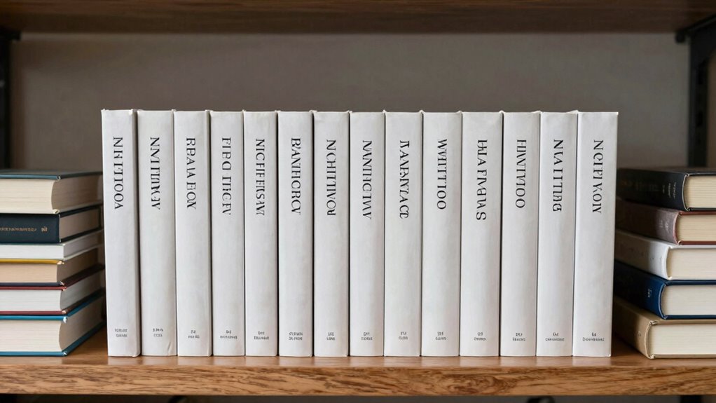
Have you ever noticed how some books instantly feel cohesive and professional while others seem disjointed? The difference often lies in the design choices made throughout the publishing process. When you prioritize design consistency, your book not only looks polished but also guides the reader smoothly from start to finish. One key element is typography hierarchy. By carefully selecting font sizes, styles, and spacing, you create a visual roadmap that directs attention to the most important parts of your content—headlines, subheadings, body text, and captions. This hierarchy ensures that your reader’s eye naturally flows through the material without confusion or frustration. Without it, even well-written content can feel cluttered or difficult to navigate, diminishing the overall reading experience. Consistent application of these design principles enhances visual cohesion, making your book more appealing and easier to read. Maintaining design coherence throughout your project also helps establish a recognizable style that can reinforce your branding. Cover aesthetics also play a crucial role in establishing a professional look. A well-designed cover doesn’t just attract attention; it communicates the book’s tone and genre instantly. When your cover aligns with the interior design and maintains a consistent visual language, it reinforces your brand and makes your book stand out on shelves or digital listings. Random or inconsistent design choices on the cover can create confusion or seem unprofessional, discouraging potential readers from picking it up. Instead, focus on a cohesive color palette, balanced typography, and imagery that complements the content. When the cover’s aesthetics match the interior’s style and tone, you build trust and set clear expectations for your audience. Additionally, design consistency extends beyond aesthetics; it reflects your attention to detail and respect for your readers. When you apply the same fonts, spacing, and style elements throughout your book, it creates a unified reading experience that feels deliberate and refined. This consistency also involves typography hierarchy, which guides the reader’s eye and enhances comprehension. A well-structured typographic system helps reinforce your content organization and makes navigation more intuitive. Disjointed design, on the other hand, can make your book seem amateurish or rushed, which can hurt your credibility as an author or publisher. The effort you put into maintaining design consistency shows that you care about quality, and that effort resonates with your audience. Ultimately, your goal is to craft a product that looks as good as it reads. When you focus on cohesive typography hierarchy and cover aesthetics, you communicate professionalism and elevate your book above the noise. Random design choices might save time initially, but they often lead to a disjointed look that undermines your efforts. Consistency, in contrast, builds trust, enhances readability, and ensures your book makes a strong, lasting impression.

CYFUN DESIGN 5-in-1 Book Cover Guide to Create Sturdy Chipboard Covers, Bookbinding Ruler, Stainless Steel Metal Book Binding Cover Tool, Scrapbooking Tools Arts Crafts, Scrapbook Cover Maker
- Versatile Bookbinding Tool: Supports corner cutting and cover positioning
- All-in-One Ruler Set: Includes guides for spine, double covers, and more
- Durable Stainless Steel Material: Long-lasting and resistant to breakage
As an affiliate, we earn on qualifying purchases.
As an affiliate, we earn on qualifying purchases.
Frequently Asked Questions
How Does Design Consistency Impact Reader Retention?
Design consistency boosts reader retention by creating visual coherence throughout your book, making it easier for readers to follow and stay engaged. When your design elements are uniform, it builds reader trust, signaling professionalism and reliability. This trust encourages readers to continue exploring your content, as they feel confident in your brand and message. Ultimately, consistent design keeps readers immersed, increasing their likelihood to finish your book and recommend it to others.
Can Inconsistent Design Increase Book Sales?
Inconsistent design might seem risky, but it can sometimes boost sales, like a surprise splash of color in a sea of sameness. When your cover aesthetics vary, it grabs attention and sparks curiosity, complementing your marketing strategies. Think of it as a wild card that appeals to diverse tastes. However, without clear branding, it risks confusing readers. Use it wisely to stand out without sacrificing recognition.
What Tools Help Maintain Design Consistency Across Editions?
You can use tools like Adobe InDesign and Canva to maintain design consistency across editions. These tools let you set and apply typography standards and color schemes easily, guaranteeing uniformity. Style guides within these programs help you keep fonts, spacing, and color schemes aligned throughout all versions. By leveraging these tools, you ensure your book’s visual identity stays consistent, making it more professional and appealing to your readers.
How Does Design Consistency Influence Author Branding?
Think of your brand as a lighthouse guiding readers through foggy waters. When your visual identity stays consistent, it becomes a beacon of genre recognition, making your work instantly familiar. This steady design helps you build a strong author brand, showing professionalism and reliability. By maintaining design consistency, you reinforce your unique voice, ensuring readers connect with your genre and trust your future books, solidifying your reputation in the literary landscape.
Is Design Consistency More Important Than Content Quality?
Design consistency is more important than content quality because it creates visual harmony and enhances aesthetic appeal, making your book instantly recognizable and inviting. When your design elements align, readers trust your professionalism and are more likely to engage. While content matters, a consistent, appealing design captures attention first, encouraging readers to explore your work further. Ultimately, cohesive visuals elevate your book’s overall impact and reputation.

Typography Essentials Revised and Updated: 100 Design Principles for Working with Type
As an affiliate, we earn on qualifying purchases.
As an affiliate, we earn on qualifying purchases.
Conclusion
Think of your book as a ship sailing through the vast sea. When the design is consistent, it’s like steady winds guiding your vessel, steadying the journey and reassuring your readers. Random elements are like scattered clouds, unpredictable and unsettling. By embracing design consistency, you create a clear, recognizable horizon — a safe harbor that keeps your readers engaged and enthusiastic for the next chapter. Let consistency be your compass on this publishing voyage.

A Dictionary Of Color Combinations Vol 1 (Japanese Edition)
As an affiliate, we earn on qualifying purchases.
As an affiliate, we earn on qualifying purchases.

Sketch Your Style: A Guided Sketchbook for Drawing Your Dream Wardrobe
- Publisher: Abrams Noterie
As an affiliate, we earn on qualifying purchases.
As an affiliate, we earn on qualifying purchases.