
Most homepage designs fail to sell because they lack a clear visual hierarchy. When key elements like your headline, value proposition, and calls-to-action aren’t prioritized, visitors get confused about what’s most important. Cluttered layouts and inconsistent design make it hard for users to quickly understand your offer. Without guiding their eyes effectively, you miss chances to engage and convert. Keep exploring to discover how to create a homepage that truly communicates your site’s purpose.
Key Takeaways
- Poor visual hierarchy causes confusion, making it hard for visitors to quickly grasp the site’s core purpose.
- Lack of clear, prominent messaging prevents visitors from understanding the key value proposition.
- Overly cluttered or inconsistent layout distracts users from the main call-to-action.
- Insufficient use of interactive elements reduces user engagement and exploration of offerings.
- Neglecting user-friendly design principles hampers navigation, leading to missed conversions.
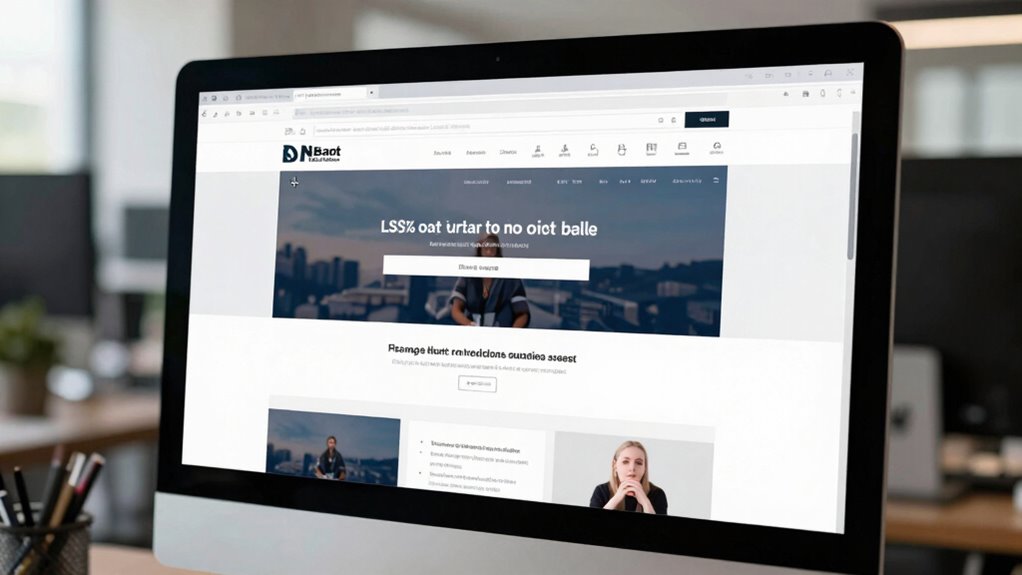
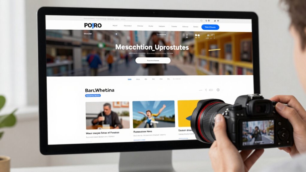
A key reason many homepage designs fall short is poor visual hierarchy. Visual hierarchy is about guiding visitors’ eyes to the most important elements first—your headline, your value proposition, your call-to-action. When this hierarchy isn’t clear, visitors struggle to understand what’s most essential on your page. Instead of quickly grasping your offering, they get lost in clutter or overwhelmed by competing elements. A well-structured visual hierarchy uses size, color, contrast, and placement to prioritize content, making it easy for visitors to scan and comprehend your message at a glance. If these principles are ignored, your homepage becomes a confusing jumble that fails to communicate your core purpose. Additionally, neglecting user engagement can cause visitors to lose interest quickly, reducing the likelihood of conversions. Incorporating interactive elements can significantly boost engagement by encouraging visitors to explore deeper into your site. When visitors are engaged from the moment they land, they’re more likely to stay longer, learn about your offerings, and eventually convert into customers. Ensuring your design is user-friendly also plays a crucial role in keeping visitors interested. Creating a clear and consistent layout helps users navigate effortlessly and builds trust in your site’s professionalism. Understanding the importance of content hierarchy ensures that your most critical messages are prominently displayed, guiding visitors naturally through your site’s offerings. Ultimately, a homepage that fails to sell what your site actually does often stems from neglecting these core principles. You must create a design that emphasizes a strong visual hierarchy, making your key messages immediately clear, and fosters user engagement through intuitive, appealing layout choices. When you do this, your homepage becomes a powerful tool—not just a digital billboard—by guiding visitors effortlessly toward understanding your value and taking action. Failing to prioritize these elements means risking lost opportunities and leaving potential customers confused or uninterested.

Visual Schedule for Adults (Red) Visual timetable for dementia, stroke victims, adults with learning difficulties, autistic adults.
Reduce anxiety and bring calm by showing an elderly person, stroke victim, adult with learning difficulties or dementia…
As an affiliate, we earn on qualifying purchases.
As an affiliate, we earn on qualifying purchases.
Frequently Asked Questions
How Can I Measure My Homepage’s Effectiveness in Sales?
To measure your homepage’s effectiveness in sales, focus on user engagement metrics like click-through rates, bounce rates, and time on page. Additionally, assess visual clarity—if visitors easily understand your value proposition and navigate smoothly, it boosts conversions. Use analytics tools to track these indicators regularly. A high engagement rate combined with clear visuals signals your homepage is working, helping you identify areas needing improvement for better sales performance.
What Are the Best Tools for Analyzing Homepage Performance?
Think of analyzing your homepage performance like shining a flashlight on a dark room. Use tools like Google Analytics to track visual engagement and understand user journey patterns. Heatmaps from Crazy Egg or Hotjar reveal where visitors click most, helping you see what’s working. A/B testing tools like Optimizely or VWO allow you to experiment and optimize. These tools give you clear insights to improve your homepage’s effectiveness and boost sales.
How Often Should I Update My Homepage Design?
You should update your homepage design every 6 to 12 months to keep it fresh and relevant. Regular updates help maintain visual consistency, guaranteeing your site looks professional and trustworthy. Additionally, refresh your call to action to boost engagement and conversions. Pay attention to user feedback and analytics, and adjust your design accordingly. Staying current ensures your homepage effectively communicates your message and encourages visitors to take action.
What Common Mistakes Distract Visitors From Understanding My Offer?
Imagine a cluttered storefront that confuses passersby—your homepage can do the same. Avoid using unclear branding and forgettable headlines, which act like fog obscuring your message. Instead, craft a clear, bold visual identity paired with compelling headlines that quickly communicate your value. Keep your design simple and focused, guiding visitors effortlessly towards understanding your offer without distraction. This clarity turns browsers into buyers with ease.
How Do Mobile Users Experience Homepage Navigation Differently?
You’ll notice mobile users experience homepage navigation differently because they rely on touch gestures rather than clicking. They prefer simple swipe and tap actions, so make sure your touch targets are large enough for easy tapping. If buttons are too small or navigation isn’t optimized for gestures, users get frustrated. Streamline your mobile design by making touch targets clear and responsive, so visitors can effortlessly explore what your site offers.
CallToU Wireless Call Buttons for Caregiver Pager and Calling System Waterproof Nurse Alert Call Buttons for Clinic Nurses Station Restaurant Nursing Home(Need to Be Paired with Receiver to Work)
The call button need to be paired with the receiver then the unit can work.
As an affiliate, we earn on qualifying purchases.
As an affiliate, we earn on qualifying purchases.
Conclusion
So, while your homepage might be aiming to tell a story, sometimes it softly misses the mark, subtly drifting away from clearly showing what you truly offer. Remember, a simple, honest approach can gently guide visitors to understand and trust your purpose. When your message resonates clearly and authentically, it naturally invites engagement. Keep refining your design, and you’ll find that the right words and visuals can beautifully nudge visitors toward what matters most—trust and conversion.

The Elements of Pop-Up
Used Book in Good Condition
As an affiliate, we earn on qualifying purchases.
As an affiliate, we earn on qualifying purchases.

ELEMENTOR WEBSITE BUILDER USER GUIDE 2026: The Complete Step-by-Step Manual to Design a Professional, Modern, and Beautiful Website That Converts Visitors
As an affiliate, we earn on qualifying purchases.
As an affiliate, we earn on qualifying purchases.